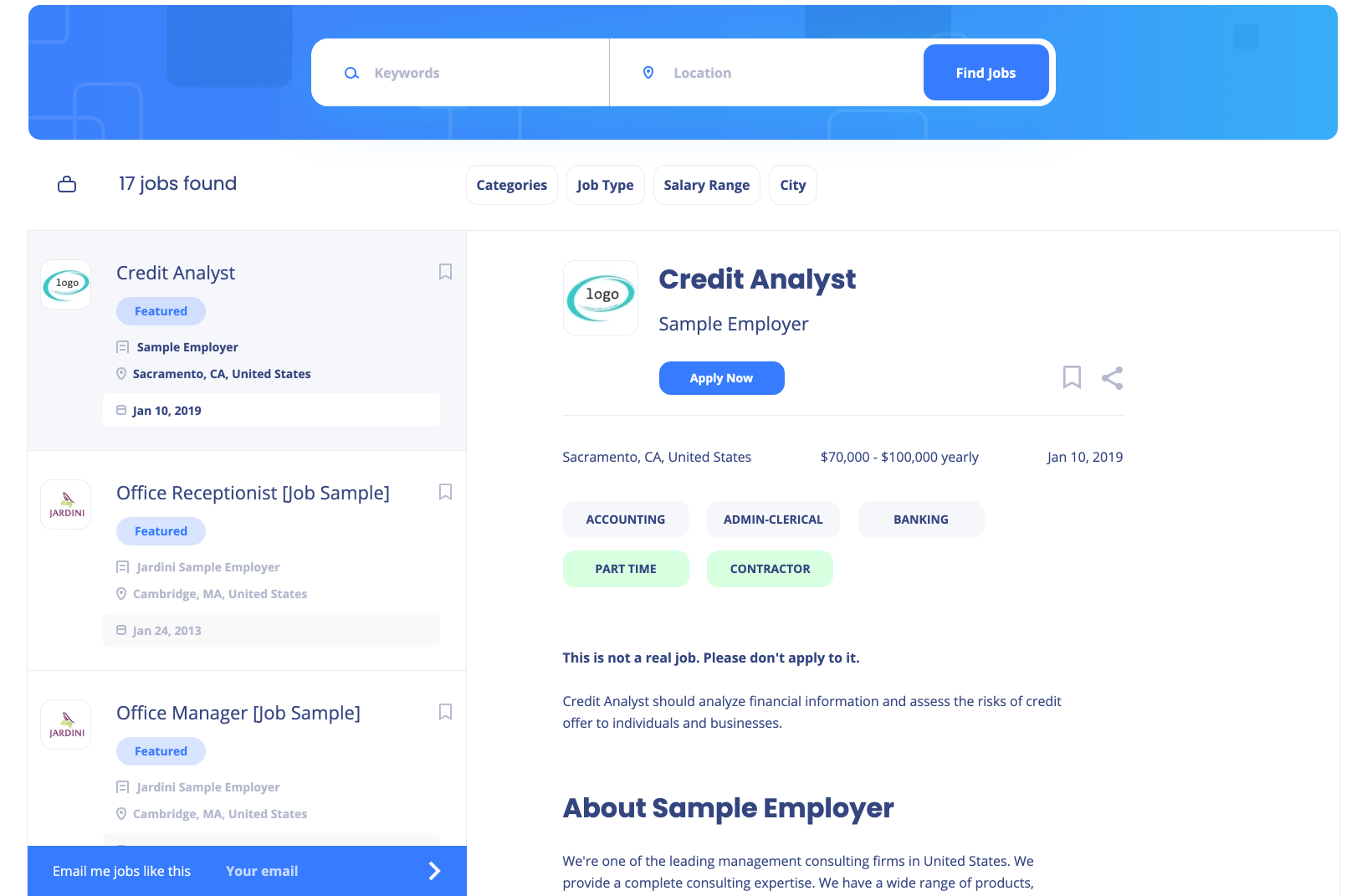
The two pane style of job board design has started proliferating across the industry as a more effective user interface to increase job views and application rates. You have most likely seen this design countless times, and perhaps even applied to a few jobs that had this layout.
The design is optimized for the best user experience, with a list of jobs in the left pane, and the details of the job you have selected in the right pane. Over the past few years, the two pane design style of job boards has been popularized by some of the largest job boards in the industry, including: Google, Monster, Indeed, and more.
Smartjobboard is excited to announce our two pane theme, titled “Shift,” to our list of templates. This new modern theme is now available for any job board created with Smartjobboard software. Moreover, the new theme includes enhanced accessibility compliance, which would make your job board website more useful for people with disabilities.

To implement the new theme for your job board, go to:
Appearance > Themes > and then select “Shift”
Please be aware, that after choosing the new theme, your custom modifications for an existing theme will not be transferred.
As always, feel free to reach out if you have any questions on how to make the most of your job board!


